|
Introduction |
To measure the dependency of observed values on one or more variables,
regression calculations are applied.
If there is only one independent variable,
a sequence of box plots can be used for visual control.
If there are two independent variables,
a glyph with constant size is more practical
and allows a denser presentation. |
1
The example is taken from
Fischer [Neue Grafiken I, 2010]: 38 f.
|
Example |
The following example1
shall demonstrate
if the mathematics achievment scores of the sample
are only dependent on the socio-economic status of the students
or if they are influenced
by the average socio-economic status of all students
at the same school. |
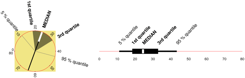
Tab. 1:
Legend for the fan diagram and comparison with the box plot
|
|
2
Fischer [Neue Grafiken I, 2010]: 27 ff.
|
Method |
[Tab. 1]
To represent the distributions,
«fan charts»2
are used.
They allow to report in a dense way
the same distribution numbers as box plots,
thus especially median and quartiles.
The circular symbol allows direct comparisons within not only one
but two directions: horizontally and vertically. |
|
|
As scale, a circular line is used.
It begins at the left with the starting value, e. g. with zero.
The following values are applicated clockwise.
The white tail of the diameter indicates the median.
The dark fan indicates the distribution of the middle half of the observed
values; thus it encompasses the values from the first to the third quartile.
The white feathers indicate the distribution of the middle 90 % of the
observed values.
The length of the white part of the diameter corresponds
with the number of observations. |
3
http:// cran.r-project.org / web / packages / nlme /:
«Linear and Nonlinear Mixed Effects»
von Pinheiro J et al.
4
The original American wording is:
«member of a minority racial group».
|
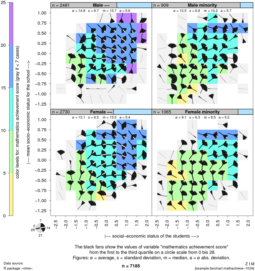
Data |
The following example presents data from the data set MathAchieve
which is part of the R package nlme
of Jose Pinheiro et al.3
It contains mathematics achievment scores of 7185 students.
The students are categorised
according to sex and membership of a minority ethnic group.4 |
|
Graphic |
[Tab. 2]
The graphics show the mathematics achievement scores in dependency
on the socio-economic status of the students (x axis)
and on the average socio-economic status of all students
at the same school (y axis).
The four graphic panels differentiate the students
according to sex and membership of a minority ethnic group. |
Tab. 2:
7185 mathematics achievement scores according to sex and membership of ethnic minority
|
|
|
Results |
The largely opened fans attract our first attention:
The achievement scores have large distributions
within nearly all subgroups (with the cells).
A comparison of the four panels indicates that the achievement scores
tend to be better for students which are not member of a minority
and that men have slighty higher scores when compared to women. |
|
|
Within the panels,
it can be seen
that both the socio-economic status of the students
and – not so strongly –
the average the socio-economic status of all students at the same school
correlate positively with the achievement scores. |
|
Conclusion |
The fan charts shown reveal how the median value
is partially following a big main tendency
while the values within the single subgroups scatter largely
what could lead to doubts about a possible correlation.
(This can seen especially well on the two lower panels.) |
|
|
|
|
References |
|
- Fischer
- Neue Grafiken I
2010
| Fischer W. Neue Grafiken zur Datenvisualisierung. Band 1: Speichengrafiken, Streuungsfächerkarten, Differenz-, Sequenz- und Wechseldiagramme. Wolfertswil (ZIM) 2010: 107 pp. Internet:
http:// fischer-zim.ch / studien / Neue-Grafiken-I-1003-Info.htm. |
![[print]](../PIC/e-div/print.gif)
![[pdf icon]](../PIC/e-div/pdf.gif) pdf file
(40 KB)
pdf file
(40 KB) Streuungsfächerkarten SILC